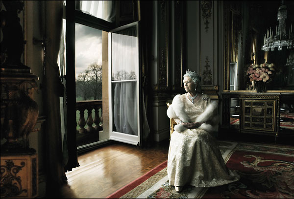
The following entires are taken from a forum in dpreview.com and talk about the Leibovitz's Queen Elizabeth photos above:
"A light is a light. don't even look at the brand unless you're looking for an effect other than "this head fills up an umbrella with light", such as "this head can annihilate sunlight at high noon at 50 feet" or "this head has such a short duration that it can stop a bullet". As long as you've got enough Ws out of your light, the brand means bupkus. you could fill a softbox with disposable camera flashes wired together and get the same light you'd have gotten from a profoto.
I would expect Annie to have used a gridded (or flagged), huge softbox for the shots with the queen. When BG is under, the subject will naturally seem to give off light. Also, I'd bet a good deal of post was done for the images. She wasn't shy about including digitally stitched files in the book (and even admits to cutting the queen out to paste into a garden scene), so I would expect that the majority of the effect is from post"
"I notice the use of an umbrella box quite a bit in clips of her work. Has anyone got any views on the pros and cons of these. Is it just a softbox with a round instead of square highlight? or are there any other advantages?
You are right about there being some post production work as in her book "at work" she says she shot the stormy garden background separately the night before.
The painterly look seems to come from the dynamic range of the image being really well controled (at least partly by the lighting). Is it likely that some sort of post production technique is used to further smoothout highlights and shadows"
"There was a making-of video on youtube and featured on Strobist. They took the video off youtube but the entry on the strobist is still there - http://strobist.blogspot.com/.../12/annie-and-elizabeth-minute-by-minute.html
As far as I can remember, one of the photos of Queen Elizabeth was done with natural light and a large Photek umbrella box or octabox.
I guess there is some special retouching recipe at work in Annie's images.
You can get some sneak peaks here too -http://www.236.com/...feed/2008/04/30/queen_elizabeth_pwns_annie_lie_6220.php (there's an octabox at 00:19, a diffusing screen at 00:24)"
"When you look at paintings from the renaissance, particularly the work of Rembrandt, and then the later works of Vermeer it becomes immediately apparent they had a profound understanding of how light worked, but they also learned how to accentuate the effects as well using mirrors and reflectors to create more dramatic contrast ratios. The final piece is the fact that they used very high quality pigments in their paints to increase the saturation of the colours.
So take these lessons over to photography. Strong directional lighting with fill lighting in the order of 1:3 or more. Most photography students never deviate very far from 1;1 lighting ratios with the occasional foray to 1:2. This can be very flattering, and good for reproduction, but its so safe and boring. Want painterly get drama, shadow, contrast, modelling, shaping. Learn how to feather the lighting, use the penumbra and umbra of the light source ( http://en.wikipedia.org/wiki/Umbra ). Add to this good saturated colour and an ability to expose for all this and you have got it licked. This can all be done as Rembrandt did it with large windows, blinds, mirrors and reflectors. The UK photographer Lord Snowden had a daylight studio built in London to produce these effects, very few of his studio portraits are artificially lit.
The ability to pre-visualise and then have the skills to make that happen are very important"I did a bit of research about prenumbra and umbra and found out that beauty dishes are used to get beautiful portraits. While doing some research on that, I found this review on beauty dishes vs. gridded softboxes. Looks like the gridded softbox is what I should use in studio.


No comments:
Post a Comment